Poster presentations are a great opportunity to share your research, gain feedback, and network with scientists from various fields and specialties. Below you’ll find some helpful tips in creating an effective poster.
- Sketch your poster first. It is often helpful to sketch how you plan to organize your information before creating the poster. This helps to visualize the layout and ensure that your poster will flow.
- Choose which software is best to create the poster.
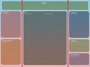
Tri-fold Poster Template from https://librarybestbets.fairfield.edu/ld.php?content_id=43580329 PowerPoint is a popular choice and arguable easiest for poster creation. URI students can receive Microsoft Office products for free at Help Desk in the Library. Google Slides is an alternative if you do not have PowerPoint. Canva is a free website that can be used to create posters. Adobe products can be used as well. Poster template provided by the Fairfield University DiMenna-Nyselius Library.
- Review poster criteria of conference or professional meeting. Conferences have specific poster requirements such as poster size, formatting, etc. Make sure to check this criteria before creating the poster for each conference (requirements may vary between conferences).
- Avoid overuse of bright colors. Using colors that are too bright might overwhelm your audience. Backgrounds that are light/neutral in color with dark text are recommended.
- Posters should be readable from about 5 feet away. Your title and section headers as well as other important information should be readable from about 10 feet away. This will ensure that people will be able to see your poster while walking by and encourage them to stop for a closer look.
- Choose an appropriate font. Title font size is suggested to be between 72-120 points, subtitles (authors’ names, affiliations, etc) 48-80 points, sections headers 50% larger than body text size (36-72 points), and body text 24-48 points. A suggested font for the title is Arial or Helvetica, which is easy to read from far away. It is important that body text font be easily readable and not distracting.
- Have a title that draws interest. Having an informative title will help attract attention and people who are interested in your field of research.
- Posters should generally range from 300-800 words. People often overlook posters with too much text. Keep body text as brief as possible. Using bullet points and lists rather than writing in paragraph form can help to avoid wordiness. If you are a URI grad student and need help with writing the contents for your poster, make an appointment for a peer tutoring session with us at the GWC!
- Use figures, images, charts, etc. Using graphics to explain and support your ideas can help to avoid wordiness. People often prefer to follow figures than read text. Make sure graphs have appropriate captioning.
*Above information was adapted from Fairfield University DiMenna-Nyselius Library: Poster Design-Tips for Creating Your Poster, Bates College-Poster-making 101, and the University of Vermont: Office of Fellowships, Opportunities, and Undergraduate Research.
Prepared by Danielle Perry, GWC Writing Tutor