This snapshot of URI’s branding guide describes the official typography for URI publishers. GSO publications also abide by this system.
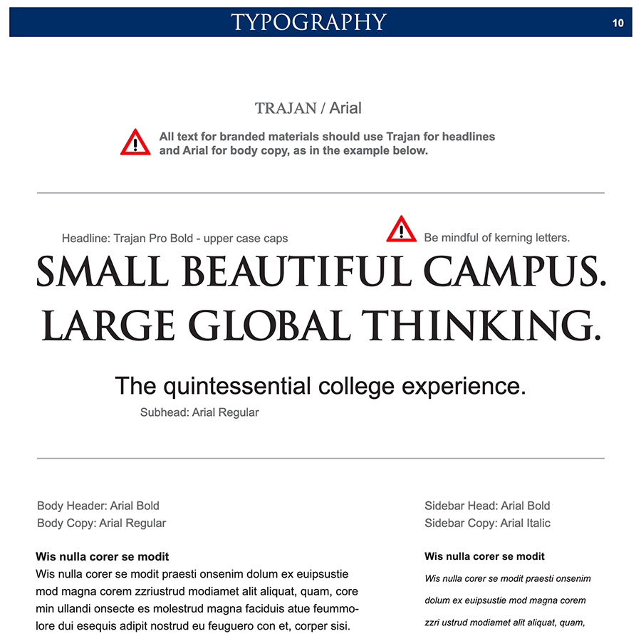
Note the use of the phrase “branded materials” at the top. Assiduously apply this type palette and system to make your publication look like an official URI document. If you only need to acknowledge URI/GSO (by incorporating a logo), and/or you’re creating a document for a third party, you may use any font family or convention as you see fit.
In the world of digital publishing, one need not think much about typography’s effect on branding. Except for uploaded image files, one can’t control typography in social media posts. While Web pages created for the URI site automatically call on correct fonts as you apply style choices like headings and quotations. You can have a look at those fonts here.
The “Arial” font family is standard on all computers equipped with MS-Office. The “Trajan” fonts can be acquired from Marketing Services.